Visual Studio and Deja Vu
This a post about fonts, not echoes of memories, just in case you’re wondering. Now, let me say from the outset that I like Consolas and think it’s a great font, but almost everyone I know who uses Visual Studio does so using either it or one of the other fixed width fonts supplied with windows.
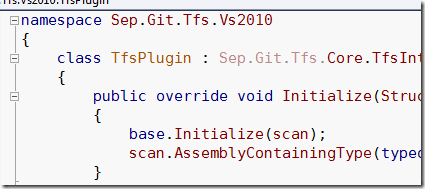
Given that the font is the thing I spend most time looking at, I wanted something a little different from the norm and that my eyes liked better so when I came across the Deja Vu font via Twitter I thought I’d give it a try. And I must say, I’m very happy with it. Here’s a screenie of it in action:
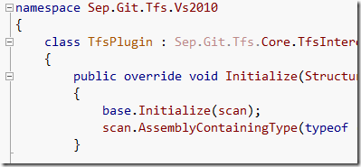
As you can see it’s got dotted zero’s, good fixed width (mono spaced) characters, is sans serif and has quite a different look to Consolas, shown here for comparison
Oh, if you’re wondering, that colour scheme is the “Easy on the Eyes” theme from StudioStyles, but with a light coloured background instead.
As a note I’m also using DejaVu for my command prompt font as well:
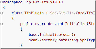
Note that there’s a trick to getting other fonts in the command prompt these days, which I only ran across recently when looking at the Meslo font, which for reference looks like this in Visual Studio:
As you can see, Meslo is similar to DejaVu in overall style but the characters are a tad wider, punctuation characters are bolded and the line spacing is a little larger as well. I’m happy to stick with DejaVu.
What about you? Are you still using the defaults or have you given your settings that personal touch? Feel free to post a comment with a link to your font of choice.


