Bad Keyboard Design
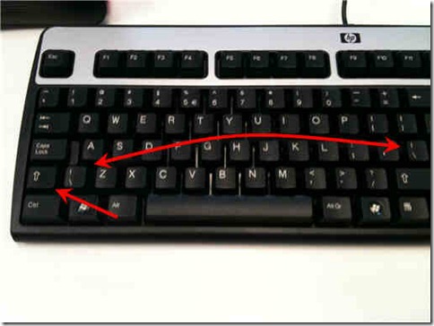
I have to wonder at times what goes through designer’s heads and wether they use their own products. Have a look at the following keyboard for a HP machine I’ve been given to use when on site.
Look at the size of that Shift key on the left there. The thing is about half it’s normal size, which of course means I keep hitting the key next to it far too often and screwing up my typing. I have to train my hands to perform more finger gymnastics than is normal, and can’t easily slide my left thumb into position like I normally would (maybe I shouldn’t use my thumb for shift, but it’s a habit I’ve picked up from gaming and it’s hard to overcome).
But maybe there’s a reason why they did it. A reason why they cut the left shift key in half but kept the right hand one full sized? Oh, there’s it is! It’s so they could add an extra (and duplicated) key on the keyboard! I for one know that the backslash and pipe characters are easily the most commonly used ones in my arsenal. On my laptop the backslash key is so worn away from use I can hardly make out the symbols on it any more. It’s worse than even the ‘e’ and return keys! Thank goodness keyboard usability was sacrificed to add an extra one of those puppies! Thank you HP! Thank you!
OK. Rant over. Time to go steal a keyboard from someone else in the office, and while I do that why don’t you let me know what the most annoying keyboard design is that you’ve used or seen?
